Logo Design &
Brand Visual Identity
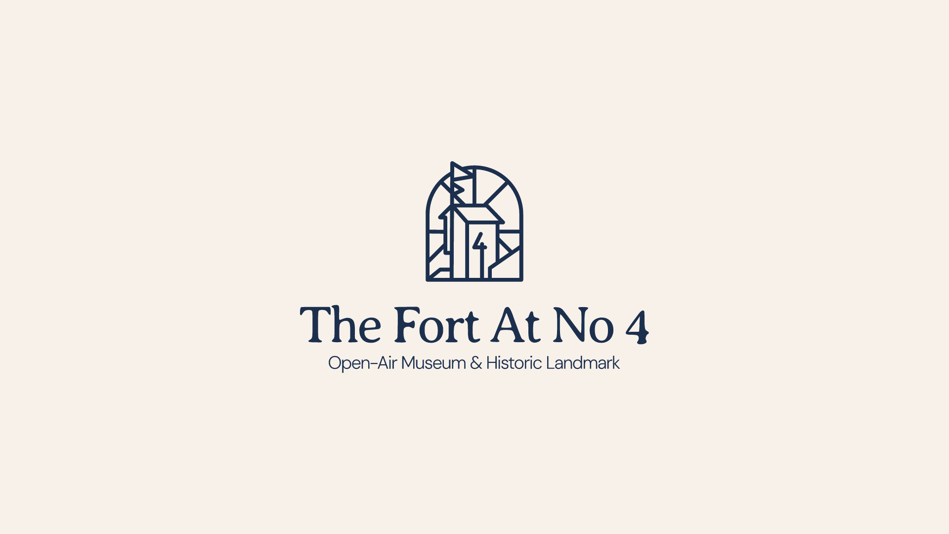
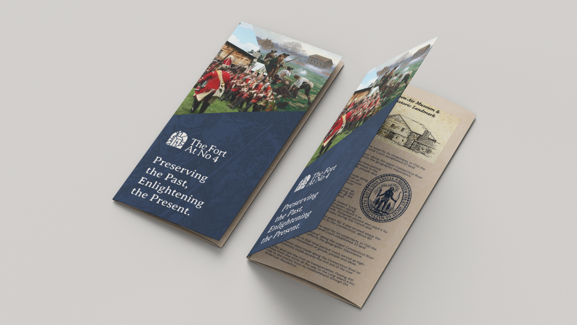
The Fort at No. 4 is an open-air museum and historic landmark that brings the history of Township Number 4 (now Charlestown, NH) to life. Through immersive reenactments, educational activities, and historical experiences, the museum preserves and shares the rich heritage of the Upper Valley of the Connecticut River.
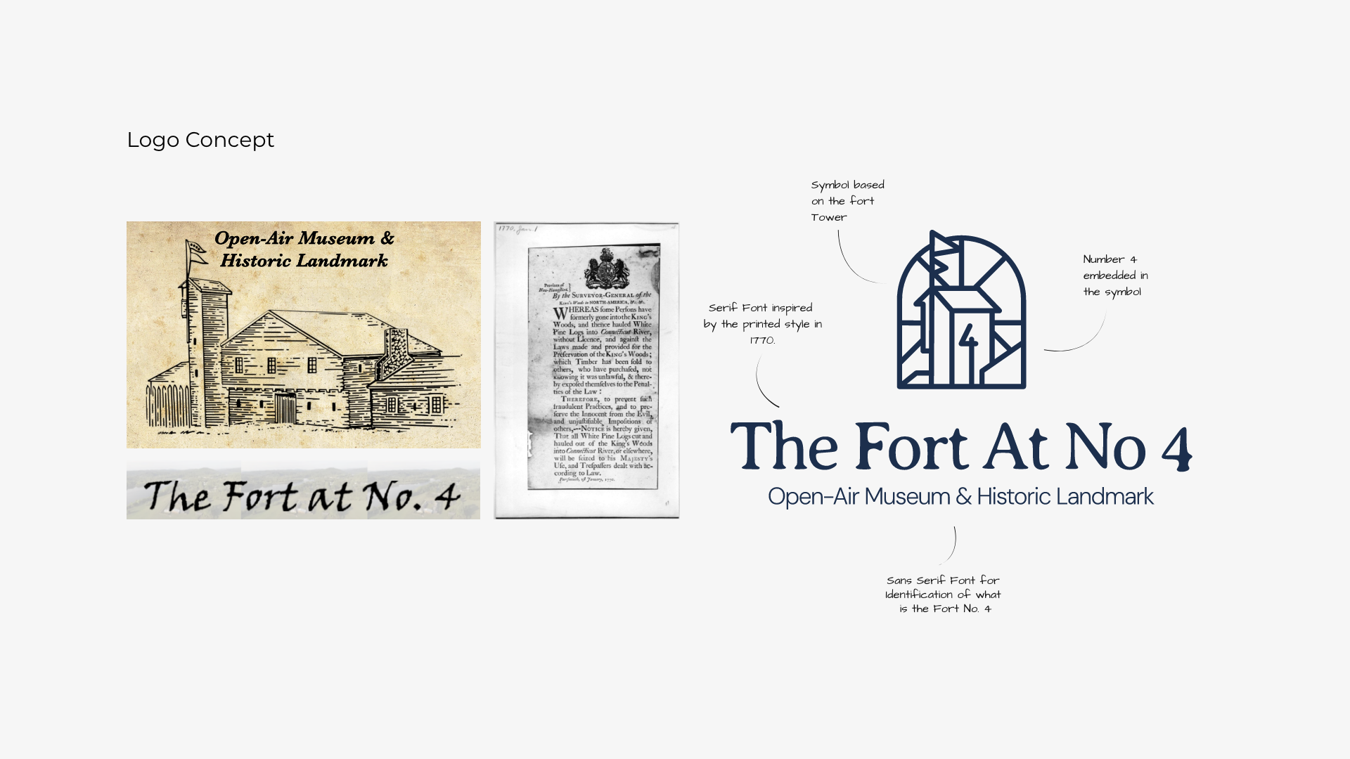
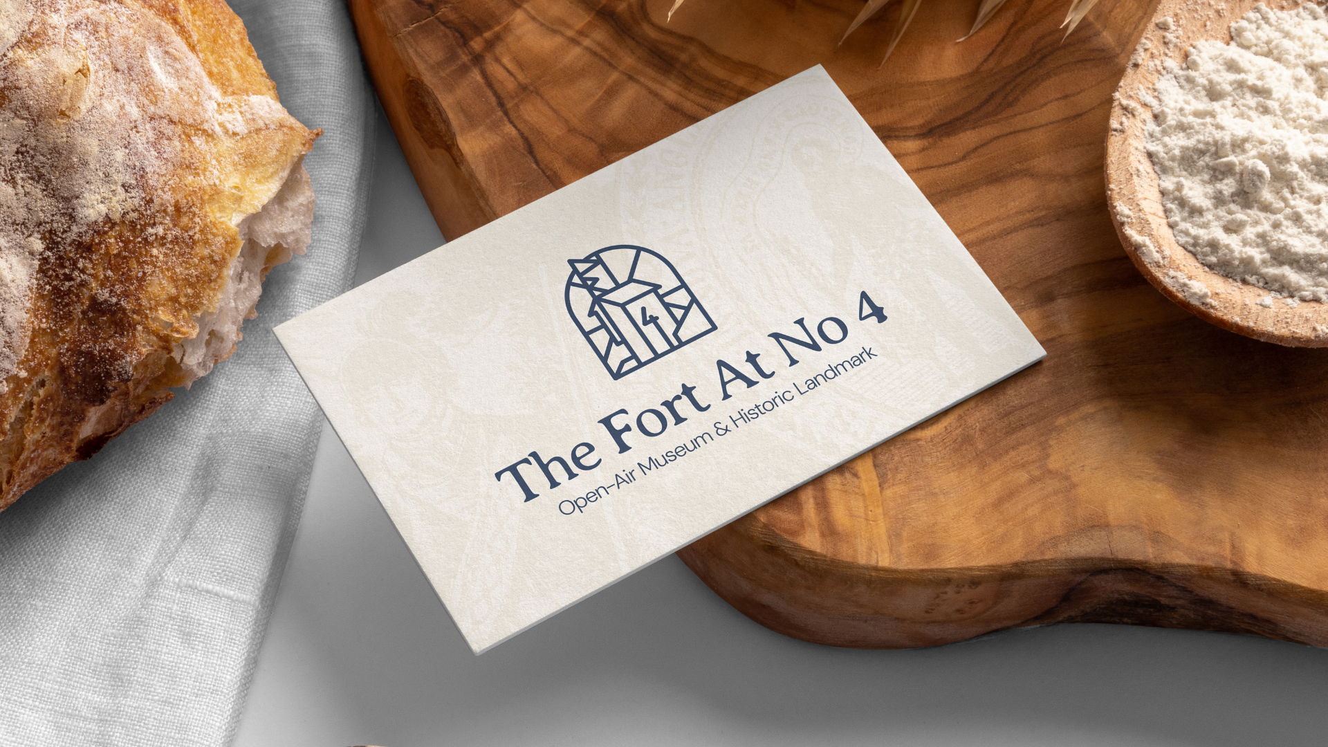
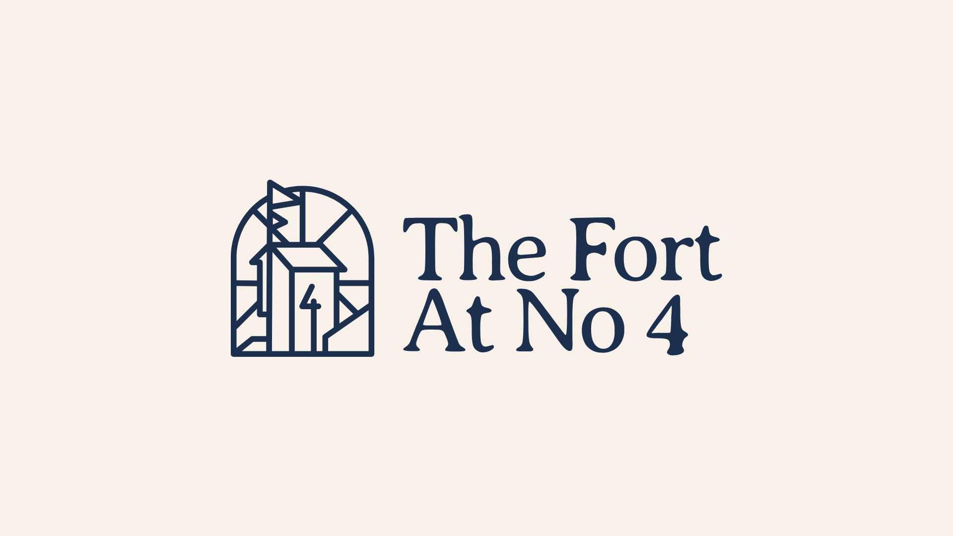
This project aimed to develop a strong visual identity that reflects the historical essence of the fort. The design features a symbol inspired by the fort tower, incorporating the number 4 as a key element.
The typography choice, a serif font reminiscent of 18th-century printed styles, reinforces the connection to the period, ensuring a cohesive and historically authentic brand identity.
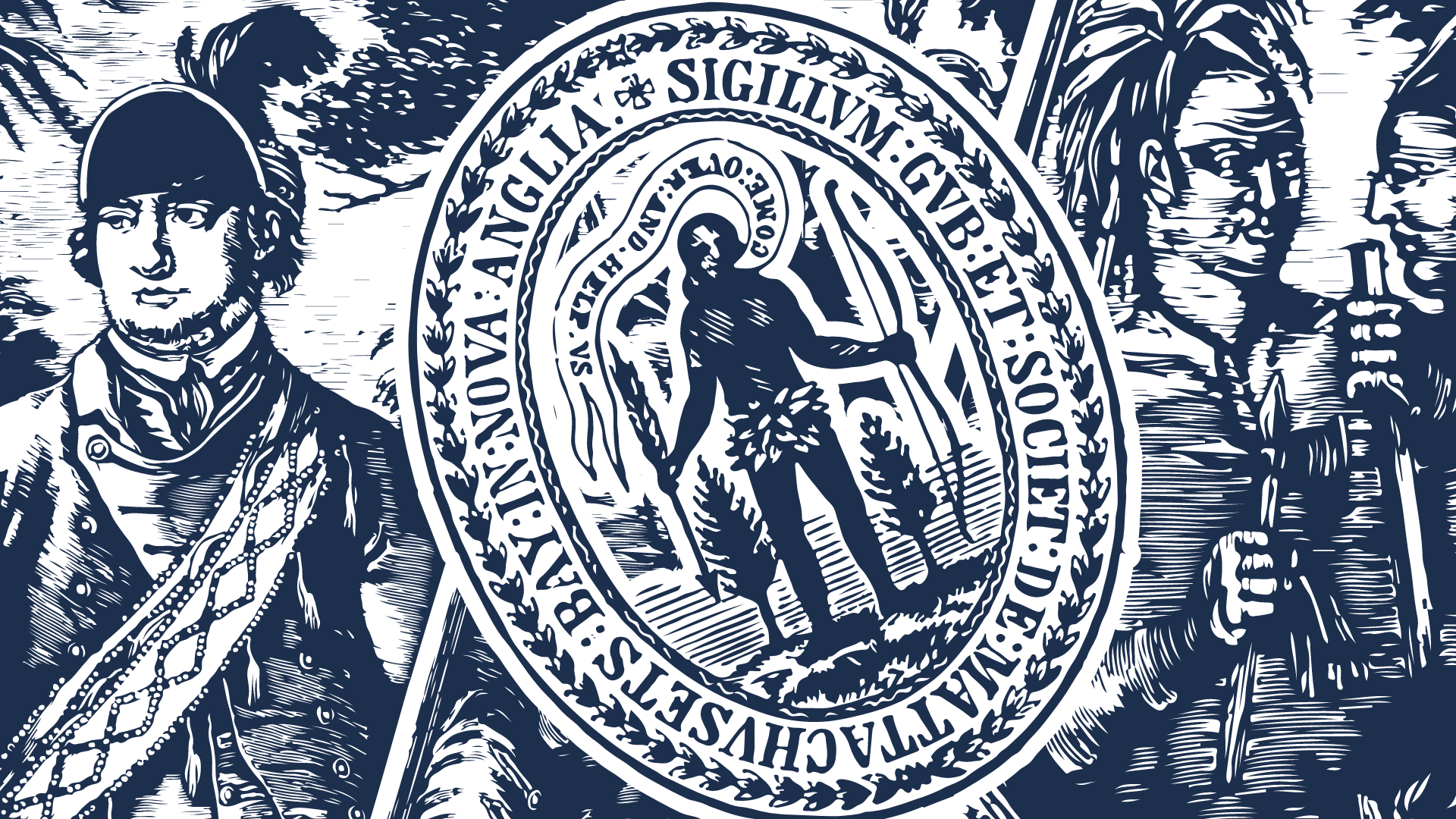
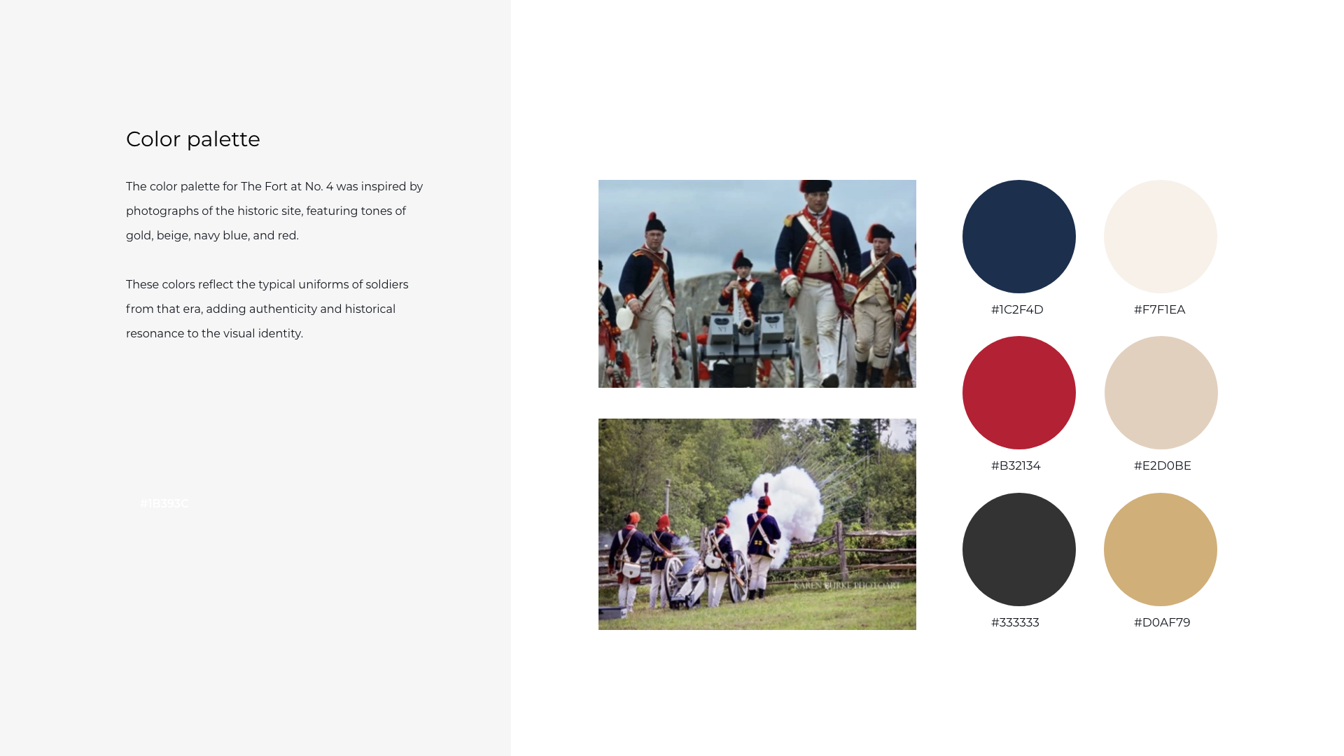
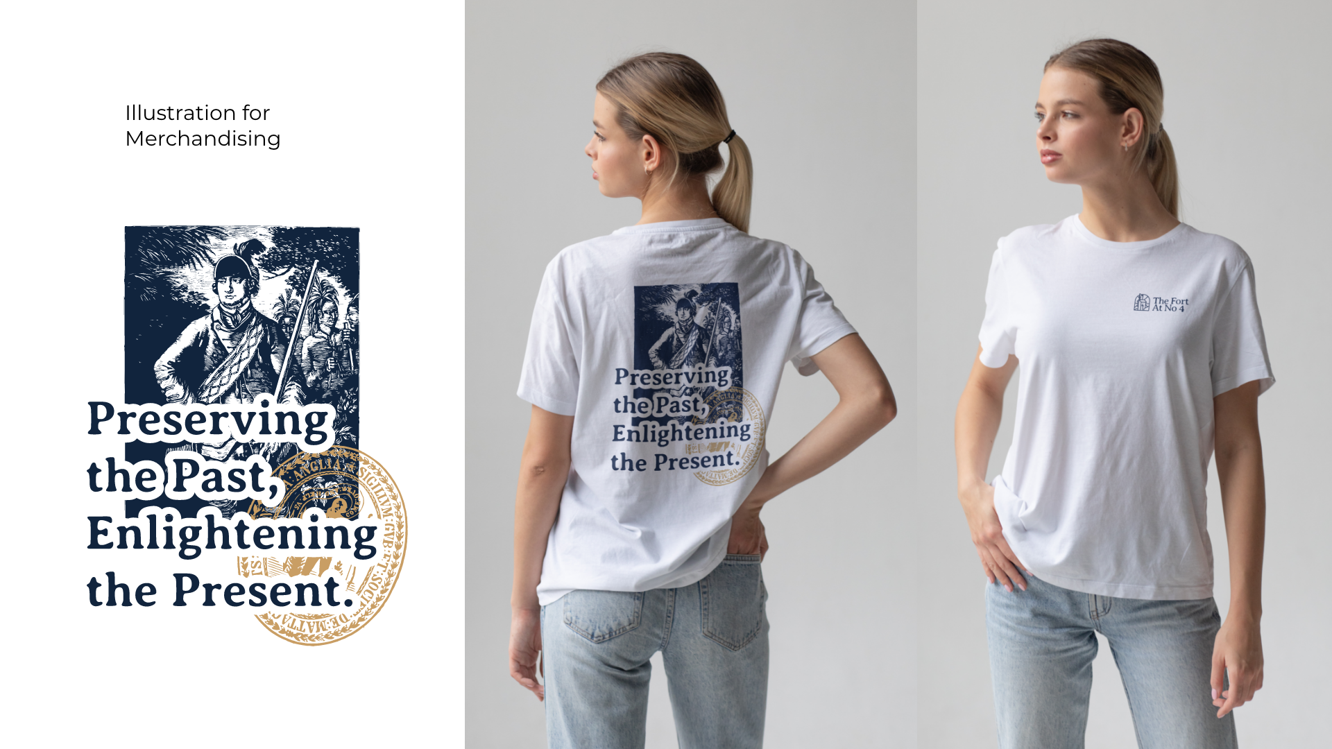
The illustrations were inspired by historical images, which were used to create patterns and backgrounds, adding depth and authenticity to the visual identity.
Logo Design and Visual Identity
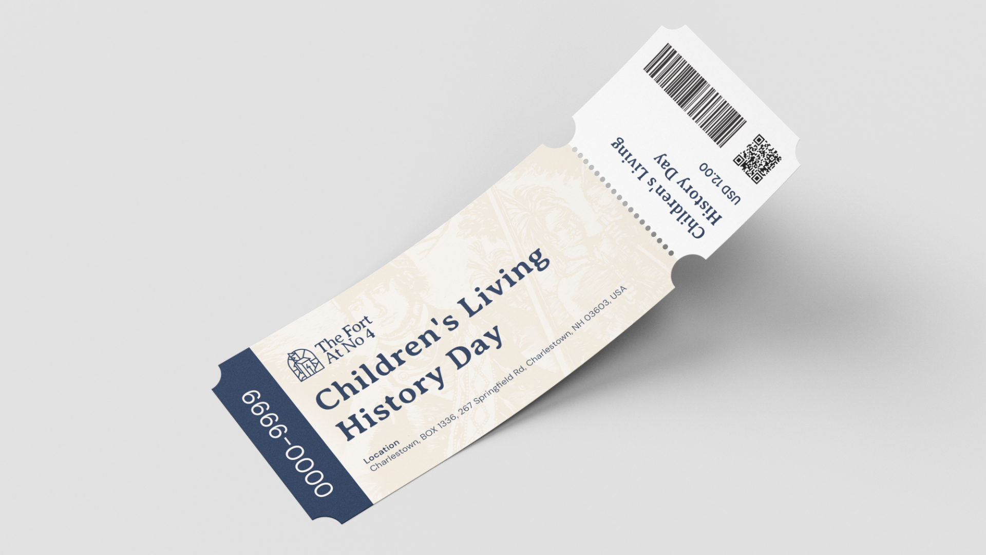
Stationery Design – Business cards, letterheads, and corporate materials.
Uniforms, Branded Merchandise & Corporate Gifts
Brand and Visual Identity Manual